de vita sua
a blog
Weekly Periodicity in Italy's COVID-19 Tests & New Cases
by John D. Muccigrosso
Like a lot of people (in my Twitter feed anyway), I’ve been spending probably too much time looking at COVID data. Since I’m spending the year in Italy, that’s meant both the US and the Italy situations. Unlike in the US, the national government here is posting data on a daily basis on a GitHub repository maintained by the Dipartimento della Protezione Civile. It gets updated daily roughly at the same time as their no-nonsense 6 pm press conferences
Some have noticed that several nations’ data show a strong dependence on the day of the week. I think this is the tweet that got it started, noting the UK trend:
@crick247: Two mondays in a row that death numbers drop by over 30% (perhaps due to registry office closed for weekend). Usual seen a sharp spike in numbers on Tuesdays. Is there one coming tomorrow?

Then John Burn Murdoch (who’s doing some great COVID-19 graphics for the Financial Times) noted it for the US, and that’s where I picked it up. Later that night as I was looking at the latest Italy data, it occurred to me that the same thing, the “Tuesday Effect,” is happening here.
Italy
The overall trend in COVID-19 here seems to be in decline, but we’ve had a couple of weeks now where two days of good drops are followed by an increase, a “two steps forward and one back” kind of thing. Here’s the chart of new cases with a simple smoothing function. (All of this is done in R; smoothing is basic ggplot2 loess.)
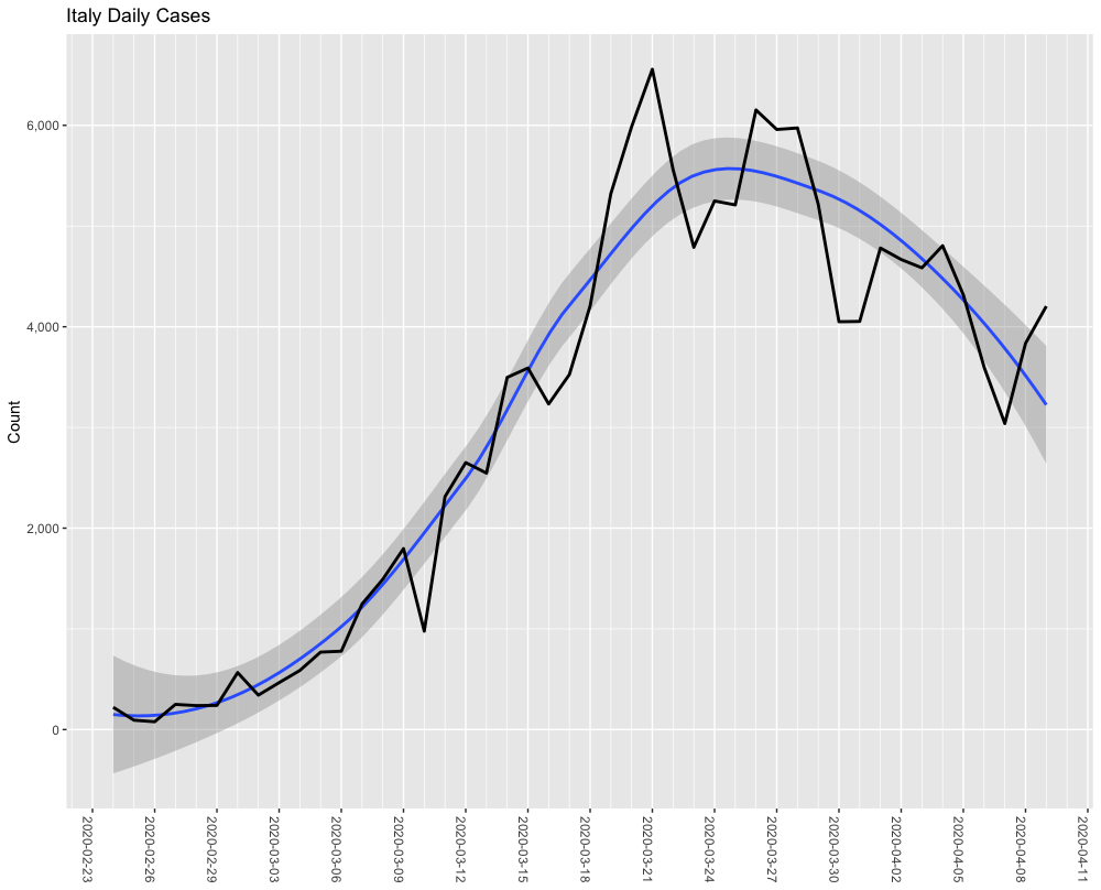
(Image by John D. Muccigrosso CC BY-NC-SA 4.0)
Lots of ups and downs, but the smoothing function seems reasonable: we’re over the hump. But looking at those little bumps with the “Tuesday Effect” in mind, they looked fairly regular, occurring over at least the past 4 weeks. Here’s the same data with nice orange lines every Tuesday (and no distracting smoothing curve):
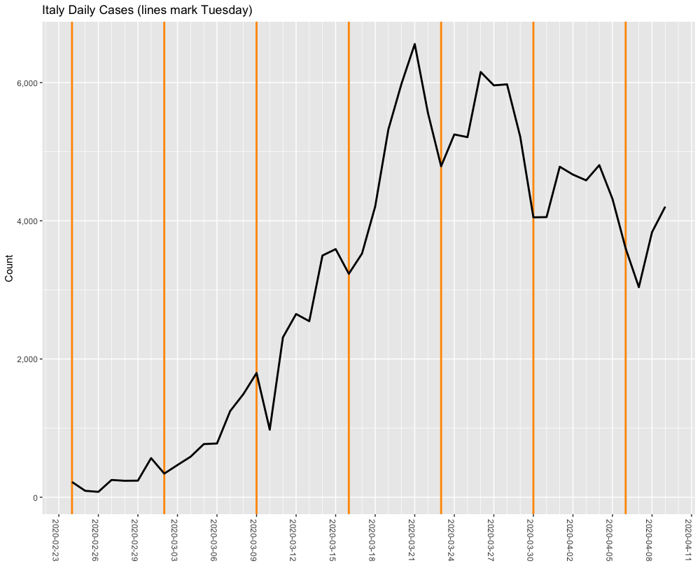
(Image by John D. Muccigrosso CC BY-NC-SA 4.0)
That’s looks pretty periodic to me. Not perfect, but lows coming early in the week on Tuesday and Wednesday, followed by highs on the weekends. So, why? Well, I’m not sure exactly, but like @crick247, I suspected it had something to do with work schedules or avoidance/difficulty of Sunday visits to the hospital. Add in a reporting delay, and you get early-week lows and late-week highs. But it occurred to me that of course you can’t find any new cases if you don’t test for them, so how do tests look? Are they periodic as well?
Italy has been testing at a fairly reasonable rate, hitting about 30k a day for a while, or about 500 per million people. That’s no South Korea, but it’s a lot better than the US,1 which is finally getting to about 80% of that, though Italy has recently upped their daily testing to over 40k. (Italy’s cumulative tests are at 1.4% of their population; US at about half that.) Here’s the same kind of chart as above for daily testing counts.
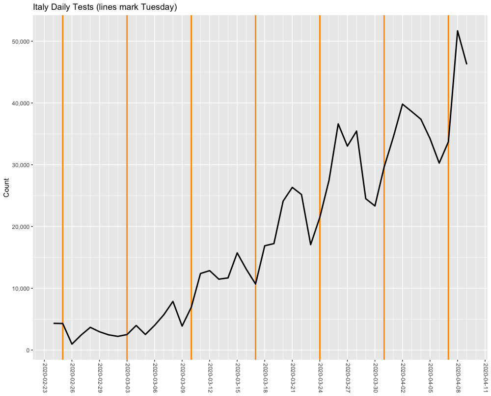
(Image by John D. Muccigrosso CC BY-NC-SA 4.0)
Once again those little bumps look pretty periodic, spiking late in the week and bottoming out early, Monday more than Tuesday. So it’s seem reasonable to think that the swings in testing are leading to the swings in cases and the whole “Tuesday Effect” in Italy.
One more chart.
I tried to subtract a baseline for each of the curves above, so that the effect of the trends would be less noticeable; it can be hard to read those ups and downs on the sides of curves. To do that, I (simplistically) subtracted the smoothed curves generated by R for each of the sets of data from the original observations. Then I plotted them together on the same chart. Since there are of course fewer new cases than tests, I multiplied the case data by a factor of 5 to put it at roughly the same scale as the tests. Orange lines again indicate Tuesdays.
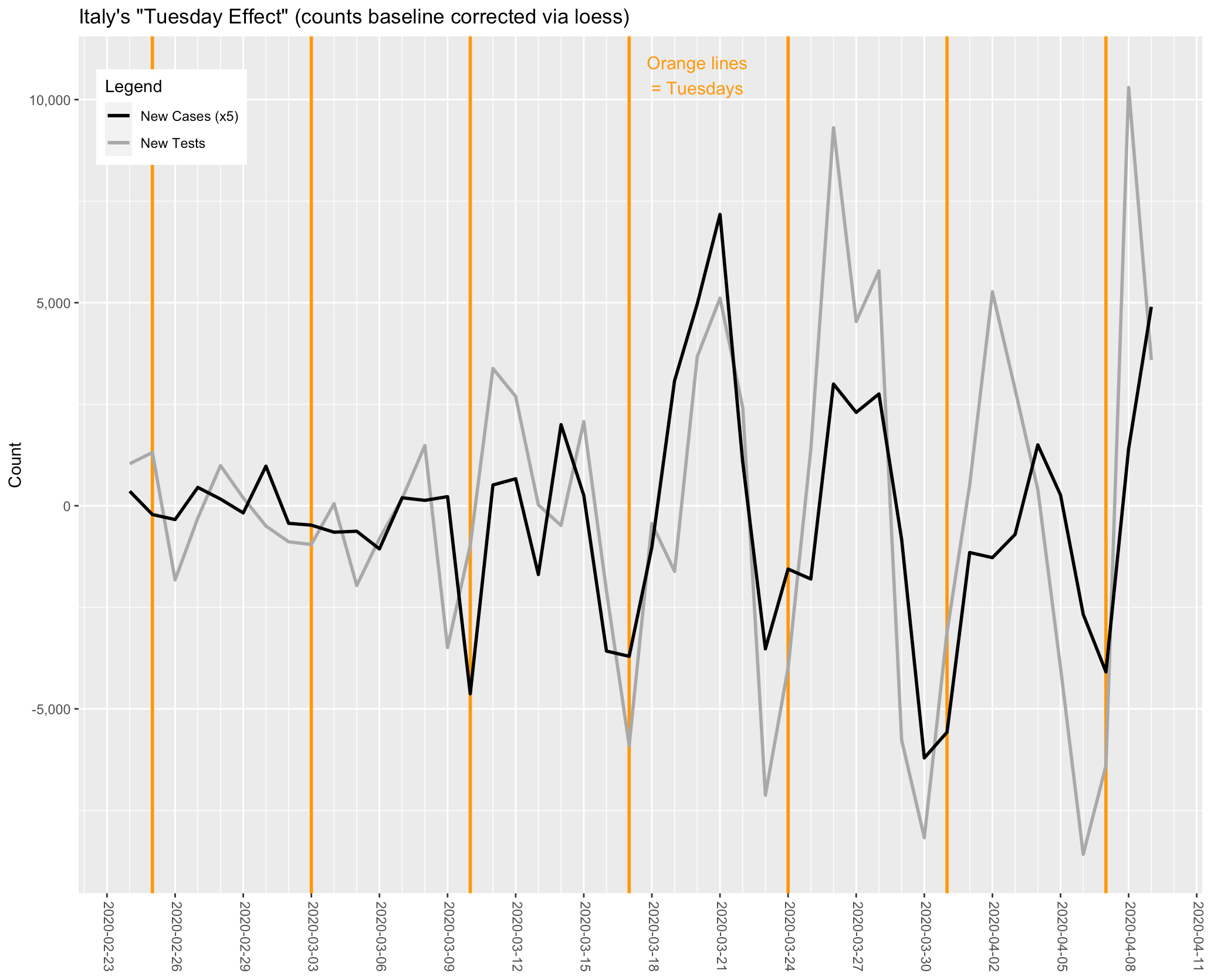
(Image by John D. Muccigrosso CC BY-NC-SA 4.0)
Three things to note:
- For the case data, two more weeks off the main peak now have Tuesdays at their weekly minima, so it looks like the effect goes back five weeks and “Tuesday Effect” is a good name. :-) (I’d argue that you can even see the late-week rise in the week starting 25 Feb.)
- There’s better correspondence between the test and the case data. It’s far from a linear relationship, as Italy has been ramping up tests as the virus has continued to spread and the various measures have dampened its growth. So the test curve is basically rising steadily, while the case curve has—thankfully—peaked and is descending now.
- In the US & UK, the Tuesday effect results in higher numbers, but in Italy the numbers are lower. (“Reverse Tuesday Effect”?)
- The original observation was made about the number of deaths, but deaths in Italy don’t seem to show much periodicity. There’s maybe a tendency lately to have a weekly increase on Friday or Saturday, but it hasn’t been present throughout. Here’s the un-adjusted chart. You can see that it’s very variable and shows no strong periodicity.
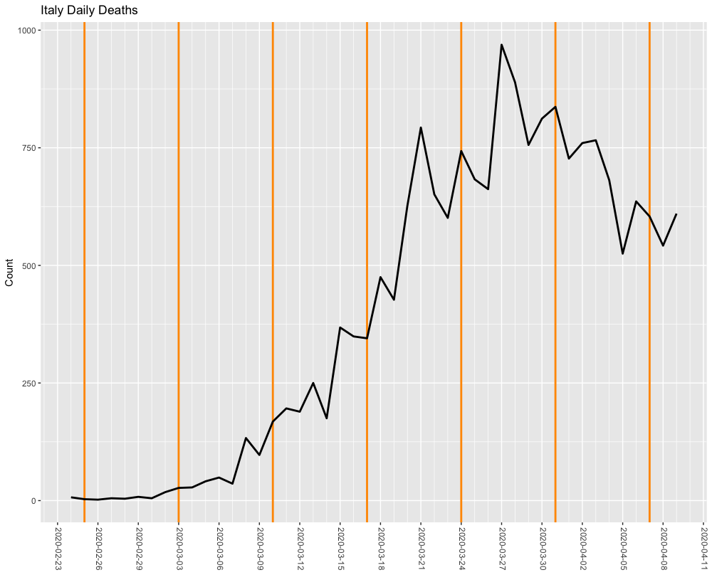
(Image by John D. Muccigrosso CC BY-NC-SA 4.0)
Implications
I don’t want to get into the prediction game here, and this isn’t the kind of analysis that leads to prediction, anyway. I’ll just note this is weekly phenomenon, so we should be careful to compare oranges to oranges, that is, Tuesdays to Tuesdays (or whatever day of the week you like). Don’t look at a Friday and worry that it’s higher than the preceding Tuesday…so long as it’s within the range of increase that we’ve been seeing.
Caveats
- The case data rely on the test data, so if the number of tests drops off for some reason—like, say, a major holiday like Easter—this whole effect could disappear.
- If the testing procedures change (and I don’t know what they are now), that could also have an impact. For example, if Italy decides to try to do large-scale random testing, that would likely change the rate at which new cases are detected. Or if regions outside the north start testing at higher levels, that could also lead to a lower positive rate.
- Italy is a big country and the situation in Lombardy is very different from that in Lazio and other more southern regions. This analysis has ignored those differences, but something more in-depth shouldn’t (though I’ll note that you get many fewer data points that way, too). I suspect the testing reliance on day of the week doesn’t vary on region, but behavior may and it is already clear that the national trend is dominated by those northern regions that have so many more cases than the rest.
If I get adventurous, I may put something down on “paper” about the woeful state of US testing, but for now, “basta così.”
April 10, 2020: I’ve made minor changes to the language of this post and added a link to the NYT database on GitHub.
-
I’m using the COVID-19 Tracking project for my US data. The New York Times has their own dataset and CNN releases figures, too. They all differ by a bit. ↩
Tags - Italy - covid - data