de vita sua
a blog
Lead pollution in the ancient world
by John D. Muccigrosso
Introduction
A fascinating article recently appeared in PNAS: “Lead pollution recorded in Greenland ice indicates European emissions tracked plagues, wars, and imperial expansion during antiquity.”1 It uses very sensitive and highly chronologically resolved measurements of lead in Greenland ice cores to calculate the prevalence of lead pollution in the ancient atmosphere year by year, and considers this “a proxy of wider economic performance” (p. 2, col. 2), since it is mainly lead–silver mining and smelting that causes it (as the theory goes).2
This is a terrific use of modern scientific analyses to take a look at the ancient world using evidence that is independent of our frequently used literary (and even archaeological) sources.
In addition to my overall interest in such scientific approaches (there’s that old chemistry MS poking at me), a few of the generalizing claims made in some of the tweets I saw about this prompted me to get to reading this sooner rather than later. (That it’s also only 6 pages long didn’t hurt.) As I read and looked at the data I got more and more skeptical of the article’s claims, or at least of the authors’ interpretations of the data. My concerns fall into two categories, one methodological and the other interpretive. In this post I just want to look at the interpretive side, assuming the methodology is great and the data are just what the authors say they are. I’ll look at the methodology in another post (soon, I hope).
For me, there are two questions: do the written descriptions in the article accurately describe the data (shown in the charts); and do the historical explanations for the descriptions make sense. Of course if the answer to the first question is “no,” it’s likely the the answer to the second question isn’t really relevant.
Apologia
Just to be clear up front, there is a ton of stuff out there on the Roman economy and trying to quantify it, and this is not my area of expertise. I do, however, know how to read a chart and have some experience working with data, so I think what I have to say here is relevant. I am always happy to learn new things and be corrected, and offer this in the interests of advancing dialogue in what I think is a fascinating area of research.
The Results
The authors have done a great service by making their data available along with the article.3 That means that it’s fairly easy for people like me to reproduce their analyses and take a closer look at the data than they provide in their article. (Not a critique: you have a limited amount of space in any article, so you pick your spots.)
I took the Excel spreadsheet they provided and turned the data there into two separate CSV files which I put up in a GitHub repository. The data I’m going to look at are the ones the authors say they used for their conclusions: “we evaluated the annual lead emissions after filtering with an 11-y median filter” (p. 2, col. 2).4
I’m going to look at the various remarks that connect changes in lead deposition to specific historical events. In particular I’m starting with their comments in their “Significance” box (p. 1):
…European emissions closely varied with historical events, including imperial expansion, wars, and major plagues.
and
Emissions fluctuated synchronously with wars and political instability, particularly during the Roman Republic…
Note that these comments almost suggest that it’s the changes in the emissions that are relevant and not their absolute values (“varied”, “fluctuated”), though the text often is concerned with the absolute values. This makes me uncertain which features of the data we should be looking at.
Reading the text of the article, one finds a number of more detailed claims. Let’s look at the data to see how these hold up.
tl;dr
This ended up being a bit longer than I anticipated, so here are some conclusions:
- The article’s descriptions of trends in the data are sometimes inaccurate.
- Historical explanations of those trends that do exist sometimes seem cherry-picked: there are places where strong features in the data are ignored or not explained in the same detail as other places which do have fairly satisfying historical explanations.
- Rome is a not regional player in the Mediterranean until the third century BCE (depending on how you want to define regional). They don’t even mint their own coinage until then. While the article starts off discussing the Phoenicians and continues for a bit with the Carthaginians, their role and the potential role of other peoples in what would become the Roman Empire is undervalued.
In sum, even if I assume the data are accurate, they don’t seem to connect very well to known historical events, at least at the kind of single-year resolution the authors would like.
Methods
I’m using fairly simple R plots to make my charts (the code for which is also on that GitHub page) and I’m just plotting the 11-yr average data, not the silver content of Roman coinage or the historical periods included in the article. I’m also leaving out the 22% uncertainty included in their charts (tough to see in figure 3, but easily visible in their figure S7), which serves to make the data look more unambiguous than they really are. Note that even though I’m not plotting it, I’m going to assume there’s a little sloppiness in the data, that is, that the measurements aren’t perfectly accurate. For comparability, I use the same vertical scale on all the charts, except for the last one. Finally a note on dating. The system Dennis the Small gave us to keep track of years has the interesting feature that it lacks a Year 0. That’s not impossible to manage in the charts, but I didn’t bother. So whenever you see a non-positive year on the chart, you need to subtract 1 to get the year BCE: 0 is “really” 1 BCE, and -700 is 701 BCE. Conversely if you want to find a year BCE on the chart, you need to add 1 to its negative: the mythical founding of Rome in 753 BCE is -752 on the charts, and so on.5
In order to show that I’m using the right data set, here’s my version of their figure 3, to which they consistently refer. I’ve tried to scale it to look like their chart. You can look, for example, at the location and relative sizes of the big peaks to see how the charts compare. (Images get re-sized to fit into the blog format, so if you find them too small, just use the contextual menu to view them alone and they’ll be plenty big.)
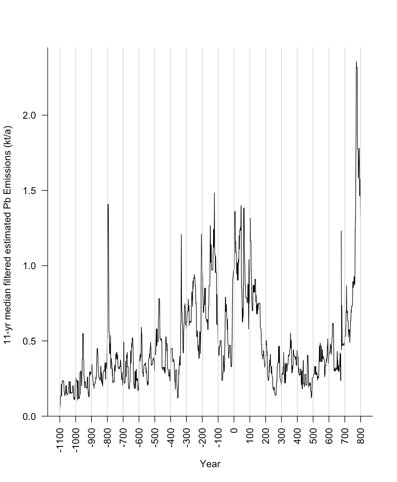
(Image by John D. Muccigrosso CC BY-NC-SA 4.0)
Looking at the overall data set, I see a lot of spikes (that is, sudden and short-lived increases in output). You might be able to explain that historically, but it makes me a bit suspicious. I said I wouldn’t get into the methodology here, but for this to be convincing it has to be explained—for example—how there’s an increase in silver/lead smelting just after 800 BCE that results in a three- or four-fold spike over the baseline, lasting less than 10 years, especially at a time when, to take one activity used to explain a lot of later activity, nobody is minting coins. If you’ve got a pre-coinage spike, why not assume that there are other, non-coin-related effects later?
Second, while I’m not a numismatist, when I look at the bullion data in their figure 3 and S7 (not shown), I see no dependence on lead emissions for the amount of silver in Roman denarii for the first two and one-half centuries or so of data (second-first centuries BCE-CE, with one small exceptional set around 28 BCE). That is, the amount of bullion is represented by a horizontal line; it doesn’t change to any appreciable degree even as the emissions data vary widely. If that’s the case, then there should be some kind of explanation for why there should be a dependence after that.6
Periods
Just for reference, here’s what one might call the traditional span of Roman rule, 753 BCE - 476 CE.
(Image by John D. Muccigrosso CC BY-NC-SA 4.0)
The early period
Let’s start with the comment about the early periods in the data series, the early Iron Age (the numbering on all the excerpts is mine):
1. Sustained increases in lead emissions began ∼1000 BCE, coincident with Phoenician expansion into the western Mediterranean. (p. 2, col. 2)
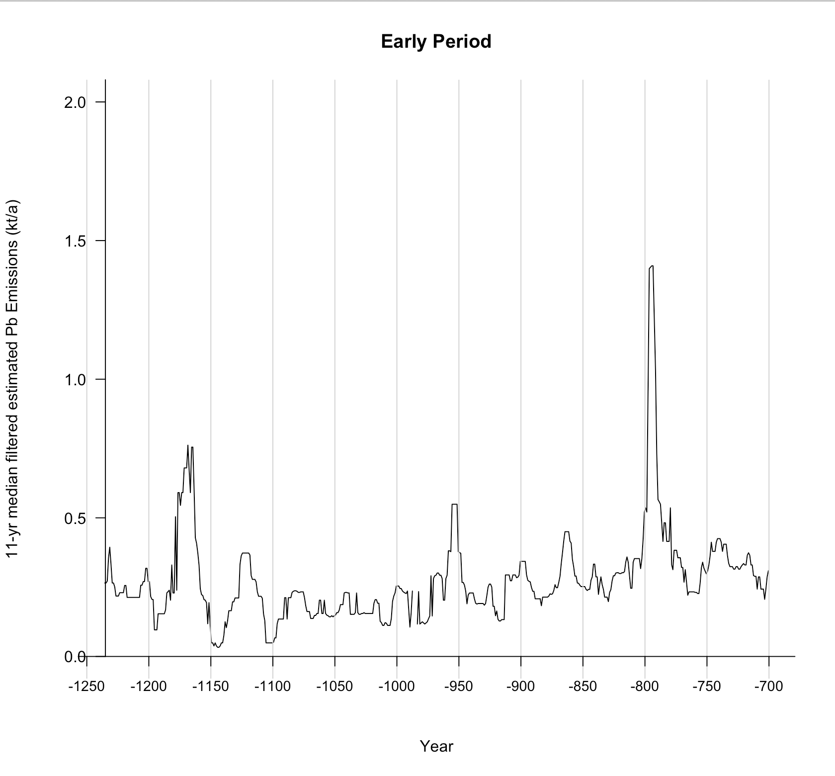
(Image by John D. Muccigrosso CC BY-NC-SA 4.0)
I guess I can see a gradual rise after 1000 BCE or so, but it’s not very pronounced or impressive. I’d be more likely to place its beginning somewhere much closer to 900, but that would depend on how you want to treat the mid-10th-century peak. In fact there are so many decent-sized peaks—not to mention that relatively big one in the mid-12th c.—that it’s hard for me to decide that there’s much of a baseline anywhere. And again, what’s going on right after 800 BCE? OK, we lack detailed historical records for this period in most of the Mediterranean, but this seems like a big event. I’ll go along with their overall description, but not wholeheartedly.
Punic Wars
Next we jump to the Punic Wars between Rome and Carthage in the 3rd c. These are certainly going to have an effect on lead-silver mining as Spain was rich in silver at the time and after the second war (218-201) it passed out of the control of the Carthaginians and over to Rome.
2. …lead emissions dropped notably at the outbreak of the first Punic War (264–241 BCE) but rose in the later years as Carthage increased its minting of silver coin to pay mercenaries (p. 2, col. 2)
3. During the Second Punic War, lead emissions initially declined but rose after Rome seized Carthaginian mining territories in southern Spain in 206 BCE (p. 2, col. 2)
Note that we’re pretty much skipping the entirety of the fifth and fourth centuries BCE, which have a major spike in the late 330s and some pretty significant activity before that, certainly well above the Iron Age baseline of the 8th c., for example.7
Here are the data, with the two periods in question framed by red and blue vertical lines.
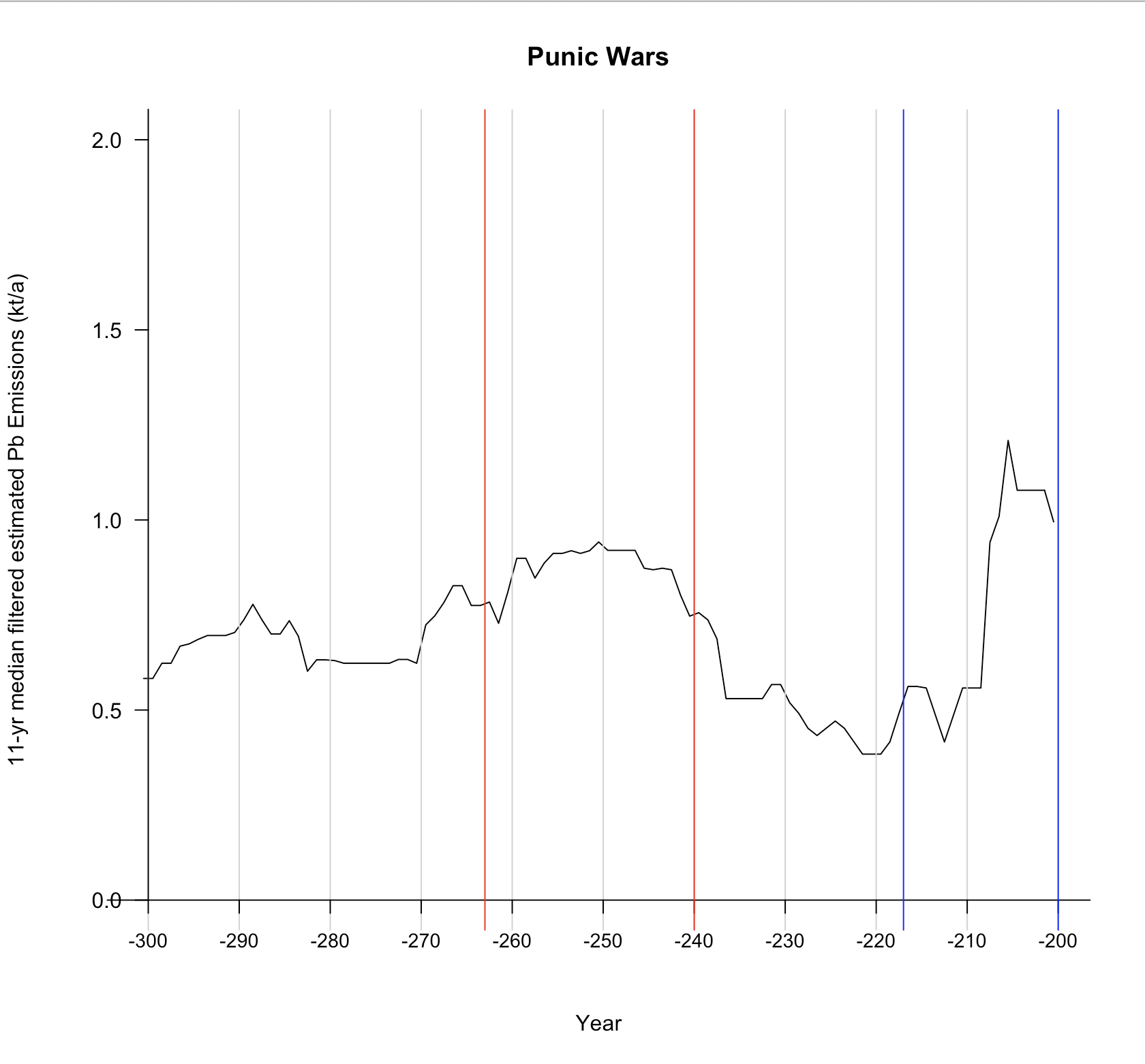
(Image by John D. Muccigrosso CC BY-NC-SA 4.0)
I don’t see any change worth noting over the entire period of the first war. If anything, there’s a drop after the war is over, but that’s possibly on trend from mid-war. In any case it certainly doesn’t “pick up” at any point during or after the war. It takes until mid-way through the second war for that to happen. As for the second war, I suppose you could interpret that brief dip as a decline, though it resumes right away before rising quickly.
As for the historical explanation, it surprises me a little that Rome would not only immediately resume the silver mining and smelting activity under the Carthaginians, but even increase it significantly, especially as a major portion of their forces leave Spain to head to North Africa (to end the war). Are they really able to ramp up production in a part of the world they’d just taken over after years of major warfare? In other words, the authors have given an historical explanation that fits their data, but that explanation isn’t necessarily accurate. It might be, but it’s dependent on their data. I just gave another historical narrative that doesn’t fit the data. This seems an example of begging the question.
The Late Republic
We then have a series of fairly specific remarks concerning what’s usually called the Late Republic, a period that saw a number of mostly internal crises afflicting the Roman state. Here’s the chart:
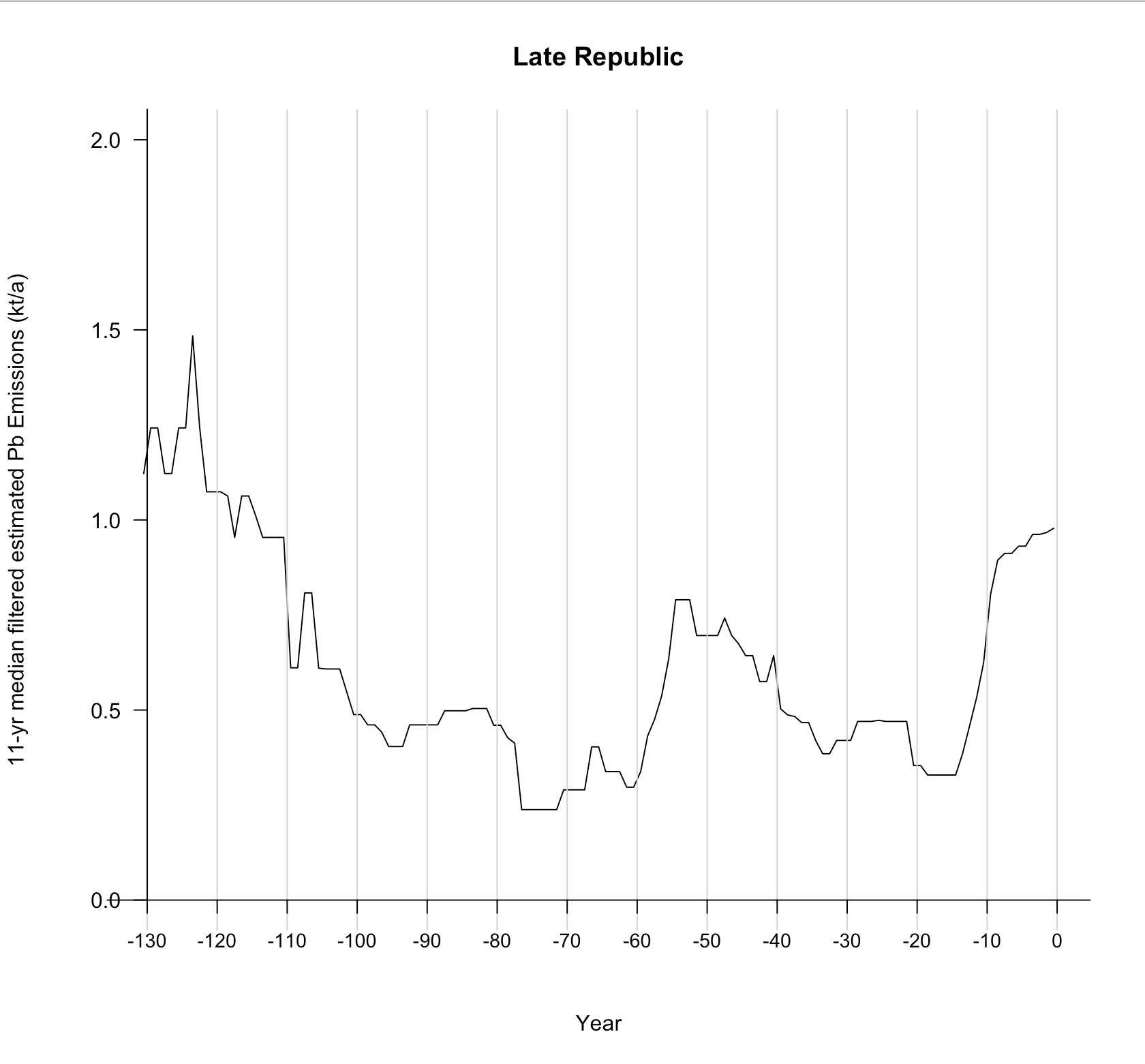
(Image by John D. Muccigrosso CC BY-NC-SA 4.0)
And here are the statements:
4. …emissions dropped sharply after 125 BCE. (p. 2, col. 2)
5. [Emissions] remained low during recurrent warfare in Spain from 108 to 82 BCE. (p. 2, col. 2)
6. A further drop after 80 BCE…coincided with the Sertorian War in Spain (80–72 BCE)… (p. 2, col. 2)
7. …emissions remained low during the next decade coincident with periodic Lusitanian raids (72–62 BCE). (p. 2, col. 2)
8. A marked recovery began only after 61 BCE when Julius Caesar, then governor of Spain, campaigned against the Lusitanians to restore order. (p. 2, col. 2)
9. This recovery was sustained for about 10 y, but arrested and reversed during the Civil Wars, from Caesar’s campaigns in Spain (49–46 BCE) until the eventual victory of Octavian/Augustus (31 BCE). (p. 2, col. 2)
Yes, emissions drop after 125 or so…and they continue to drop pretty steadily until the mid-90s, followed by a little rise to a plateau in the 80s. So while the first statement (#4) is accurate, the second is a little misleading as it ignores the continuing drop and subsequent steady, higher level of the 80s. #6-9 also accurately describe the data. However, while emissions stabilize after Actium, the dip about ten years later receives no mention. Overall then the description of the data for this period is of inconsistent accuracy.
On the historical side, I’m bothered by the equivalence of the various different kinds of “warfare” going on. We have the Roman efforts at what might euphemistically be called pacification of their Spanish provinces, Sertorius’ civil war activities, raiding by native peoples which when stopped allegedly brings emission back up to levels not seen in generations, and finally the Roman civil wars in which Spain played a fairly minor role. Did all of these have similar effects? And if warfare has such an effect, wouldn’t production all over the empire have picked up under the new Pax Romana between 31 and 15 instead of declining?
10. The repeated pattern of dips in production coinciding with the outbreak of wars primarily affecting the Iberian Peninsula, and then recovery again after the end of each war, suggests that warfare caused major interruptions to lead–silver production during the middle and late Roman Republic. (p. 2, col. 2)
In light of the foregoing and of the absence of data on mining output by region, this seems an overstatement.
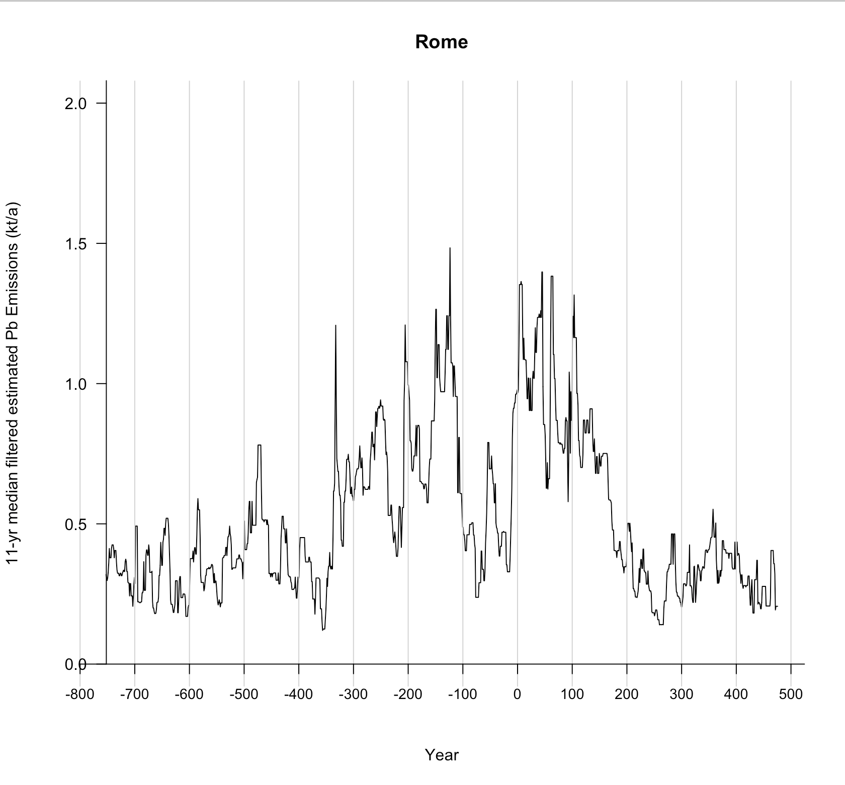
The Empire: The first century
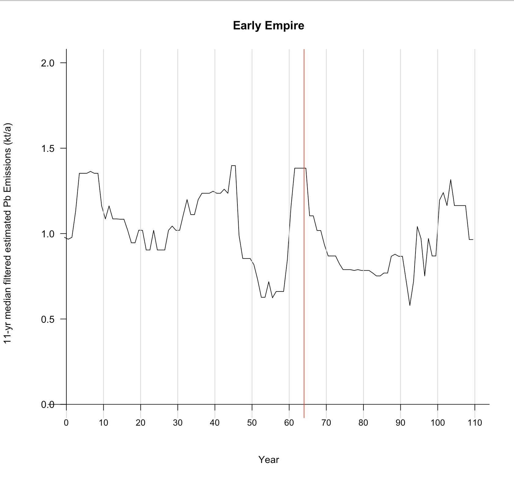
(Image by John D. Muccigrosso CC BY-NC-SA 4.0)
11. Following a rapid rise in emissions starting in 17 BCE, emissions remained high until the 160s, again with short-term fluctuations. (p. 2, col. 2)
12. The decline from the highest first-century CE peak occurred in 9 CE, coincident with Roman abandonment of territory to the east of the Rhine, including the Sauerland mines, after three legions were annihilated in the Teutoburg forest. (p. 3, col. 1)
13. A sharp drop in lead emissions coincided with debasement of the denarius silver content in 64 CE… (p. 3, col. 2)
The description here isn’t bad, but it’s not great either. There are some short-term fluctuations, but for some reason they now don’t all require explanation, even though we know a lot about the history of this period. Emissions do drop after 64 (and its debasement), but they stay above the levels of the late 40s and 50s. If this is due to the debasement of coinage, what happened earlier? (And see my comment above about the relationship of coin bullion to the emissions.) Does the awful civil strife of 68-69 (the so-called “Year of the Four Emperors”) not have an effect? Finally the dip after 9 does coincide with the Varian disaster, but that dip is from a relatively recent and short-lived high. Why explain the end of that high, but not its start?
The Second century and the Antonine Plague
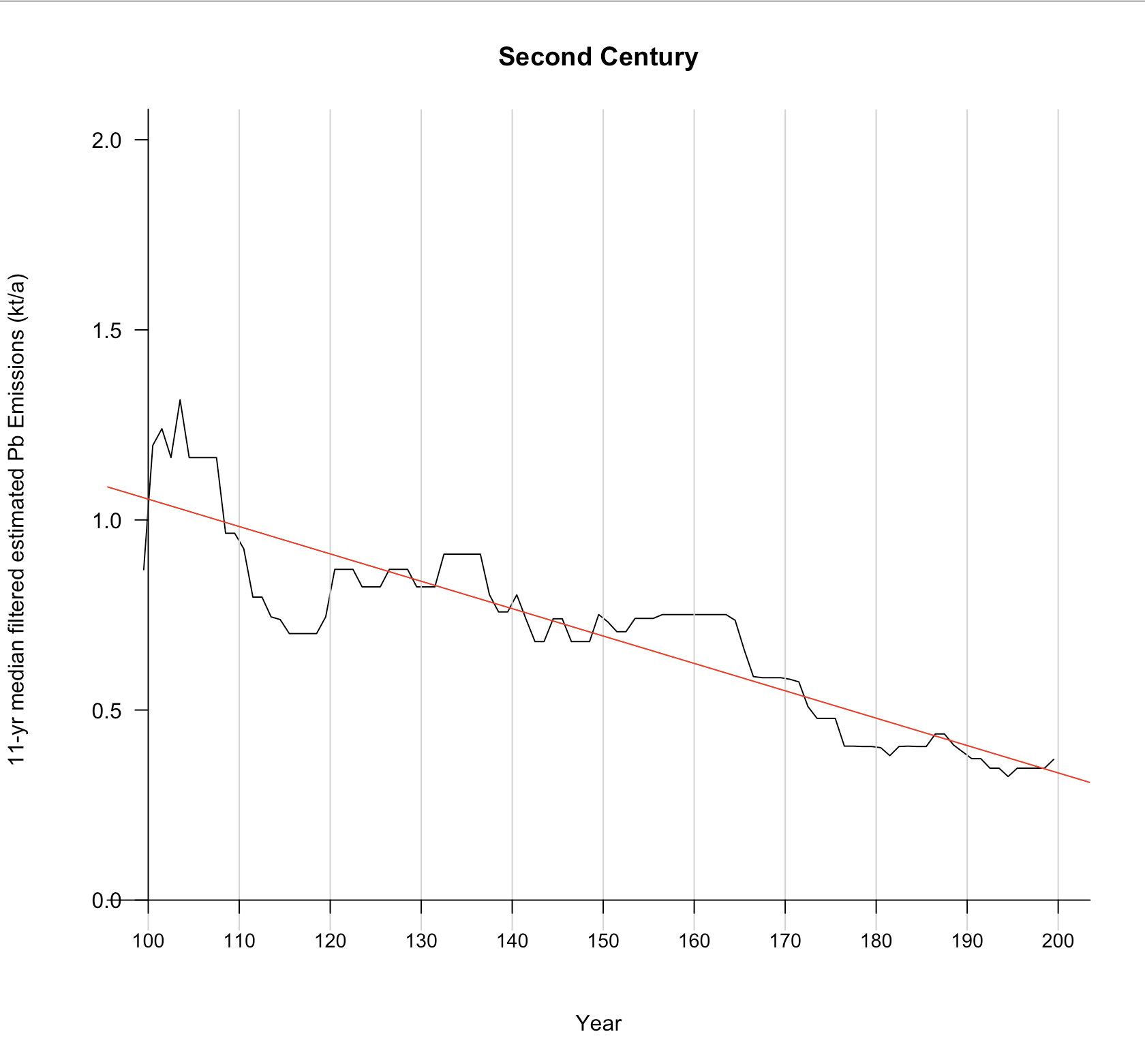
(Image by John D. Muccigrosso CC BY-NC-SA 4.0)
14. …a short-lived peak in the early second-century CE coincided with a brief period of new metal use again (103–107 CE) (p. 3, col. 2)
This observation is fairly accurate, though it’s worth noting that the increase in emissions starts several years before 103.
15. The Antonine plague emerges as an abrupt transition… (p. 3, col. 2)
If I forced you to point out on this chart the period of massive death due to plague, when perhaps a third of the population of the empire died, you’d probably put it ~108, but there simply isn’t much that’s “abrupt” about these data. The whole century looks like a gradual and continual drop-off, which is why I added the least-squares line to it: it’s a pretty good fit. Even if you are convinced by the drop in the 160s, you still need to explain the larger earlier drop and recovery in the 110s.8
Trends in the data here also don’t seem to reflect the historical record: they show neither the empire reaching its peak geographic size (despite the title claim of “track[ing] imperial expansion”) nor a large impact from the Antonine plague.
The Third-Century Revival
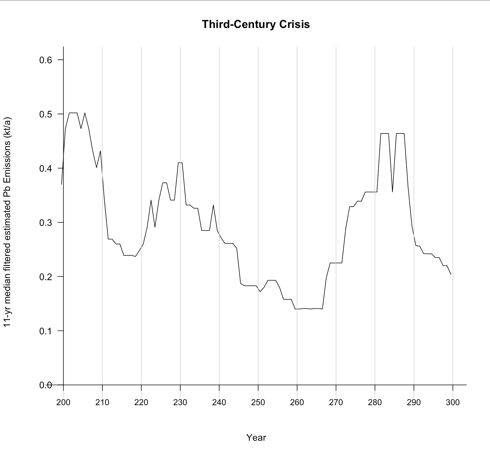
(Image by John D. Muccigrosso CC BY-NC-SA 4.0)
16. …lowest emissions at any time after 900 BCE coincided with the third century Imperial Crisis from 235 to 284 CE, and in particular with the severe pandemic known as the Plague of Cyprian (249–270 CE). (p. 3, col. 1)
17. The final debasement of the denarius in the third-century CE to a silver content of under 4% coincided with the absolute nadir in lead emissions in our record after 900 BCE (p. 3, col. 2)
There really isn’t any description of the variation seen in the third century. It surely is the low point in emissions, which makes even minor absolute variations more evident, but the authors make no attempt to explain those variations explicitly, though they do hint at them. The Plague of Cyprian indeed maps to the lowest phase of emissions,9 but it’s worth noting that emissions drop before the plague hits in 249 and are on their way back up to pre-crisis levels well before 284. And then what happens right after 284 when they plummet again? The Imperial Crisis doesn’t really help explain what’s going on.
Nor is the debasement of the coinage all that helpful. It reaches a low in the early third century, but emissions then pick up after that happens.
And now that we’ve dealt with both plagues the authors mention:
18. the nearly immediate and persistent emissions declines following major plague outbreaks suggest low societal resilience and far-reaching economic effects (p. 3, col. 2)
As noted, I don’t see either plague producing a major effect relative to their respective time periods, and the recovery after the Plague of Cyprian is both immediate and significant.
Later
19. The first major recovery in lead emissions after the Antonine plague occurred ~750 CE, with resumption of early medieval mining in France, notably the Merovingian mine and mint at Melle, and in Britain around Wirksworth in Derbyshire. (p. 3, col. 1-2)
It seems that “major recovery” excludes the sharp peak in the later 7th c. which goes not only unexplained, but uncommented on. (That neither of these sets of mines and mints is in Spain gets to a methodological issue…for next time.)
Conclusion
Hopefully the foregoing justified the tl;dr I wrote at the top. Let me just add these two points.
We know about a lot of ancient-world historical phenomena (HP). Sometimes one of those HP temporally correlates with an event in some other series (like these emissions data). But there are plenty of HP we don’t know about and there are plenty of HP that don’t have any effect on that series of events. This is the cherry-picking I was talking about above. I’m not saying that none of the HP the authors connect with their data really had a causal relationship to them, but rather that there are enough cases in which there either don’t seem to be HP to explain clear phenomena in the data or for which the authors descriptions of the data aren’t accurate, so that I’m not convinced that the correlations they do find indicate causality, at least on the micro-scale the authors are pushing for.
I’m also uncomfortable using variations in lead-silver mining (via the emissions data) as a proxy for economic activity. Is it not possible for mining/smelting activity to be unconnected, especially in the short term, to economic activity? Thus, for instance, a dip in mine output or a shift to a more debased coinage would show up in the data even as the economy boomed. (See my initial remarks above about whether its the emissions values or the change in them that matter.)10
Finally, I wonder whether the data aren’t really as reliable as the authors suggest…but that’s the next post.
Footnotes
-
McConnell, Joseph R., et al. “Lead Pollution Recorded in Greenland Ice Indicates European Emissions Tracked Plagues, Wars, and Imperial Expansion during Antiquity.” Proceedings of the National Academy of Sciences, May 2018, p. 201721818. Crossref, doi:10.1073/pnas.1721818115. ↩
-
Note that the comments of Andrew Wilson, the Classicist co-author, in the NY Times piece are a bit more measured: “I wouldn’t say the lead pollution graph is a close reflection of GDP but it’s probably the best overall proxy for economic health we’ve got.” ↩
-
To be precise it’s published under a PNAS license, which provides for Creative Commons Attribution-NonCommercial-NoDistribution License (CC BY-NC-ND 4.0). ↩
-
I want to thank lead author, Joseph McConnell, for helping me understand the data better in response to some email queries I sent him. ↩
-
Astronomers keep track of time like this: with a zero in their timeline and negative numbers before that. This makes looking at, say, eclipse tables, a bit pesky…at least for me, but it does make the math easier. ↩
-
Again, I am not a numismatist, which means there may well be explanations of this type out there and I’m ignorant of them. Very happy to be better informed! ↩
-
The authors address this whole period summarily: “Sustained high emission levels in the mid-fourth to second centuries BCE corresponded to intensive mining in Carthaginian and Republican Roman Spain…” (p. 2, col. 2). ↩
-
The NY Times piece calls this a “dramatic drop”. ↩
-
Doesn’t the plague end in 262, not 270? Harper, Kyle. “Solving the Mystery of an Ancient Roman Plague.” The Atlantic, Nov. 2017. The Atlantic, https://www.theatlantic.com/science/archive/2017/11/solving-the-mystery-of-an-ancient-roman-plague/543528/. ↩
-
Once again, this is getting out of my area of expertise and I have not read all the works cited by the authors, so I will happily be corrected on this point. ↩
Tags - technology - archaeometry