de vita sua
a blog
Charts for Ancient History
by John D. Muccigrosso
I’m teaching Roman history this spring after a bit of time away from it. I’m also creating some charts to demonstrate some of the things I usually just talk about. I figured I’d share them. As usual they’ll be in their own repository on my GitHub.
I’m using R to do the charting and I’ll include the code I used to make them in the repo. Lately I’ve been using ggplot, which I find powerful, but finicky, so that’s taking most of my time. I’m doing the charts in four different color schemes: two black and white (with the bars in each color), one grayscale, and the fourth in color, using Viridis, a scheme that should be readable by those with colorblindness.
I’m also trying something new by using pandoc to create an ePub of the charts with some explanatory text and an appendix with the code and the data to the extent practicable.
So far
So far I’ve done two histograms:
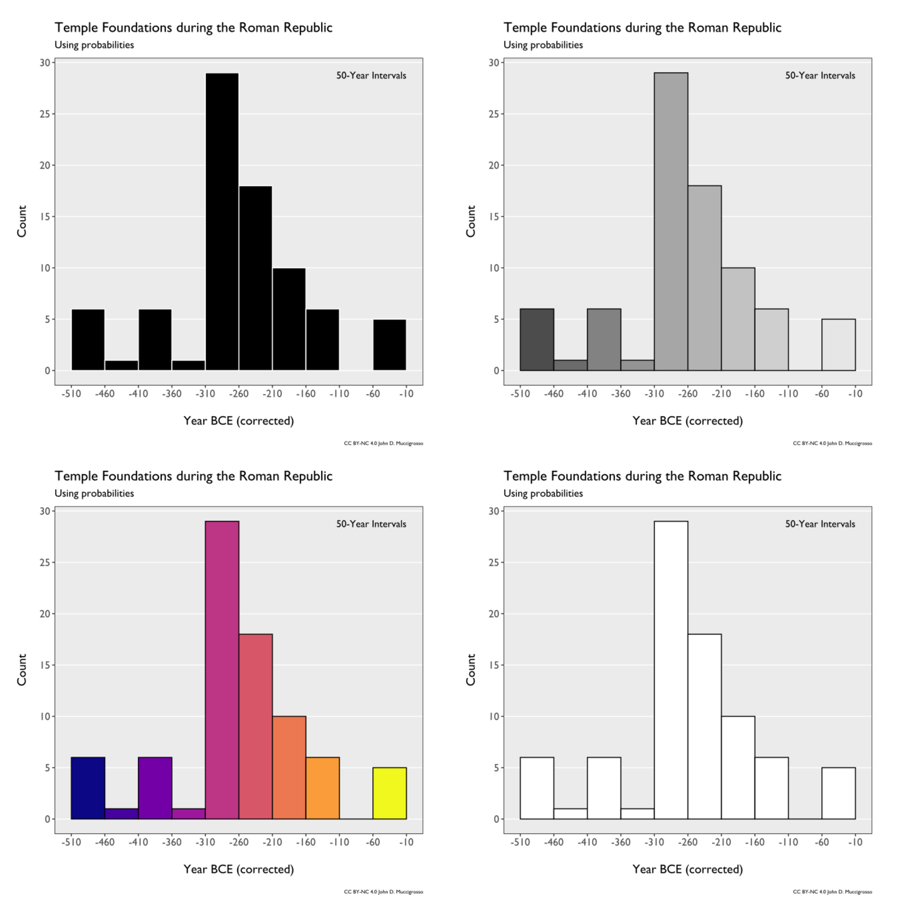
- Distribution of dictators over the course of the Republic (after which they cease to exist). This is pretty straightforward. I rely on the Fasti and make only one adjustment: no dictator years.
- Frequency of Republican temple dedications in the city of Rome. This required a little more massaging of the data. In a lot of cases we don’t have any account of the dedication of temples. Often this is presumed to be because the dedication occurred during those periods for which we don’t have Livy’s account. Livy was pretty good about recording such things and it often does look like the construction occurred during his missing books, so the conclusion seems warranted. For the Republic a crucial missing part of Livy is books 11-20, covering the years 292 to 218. Everything after 167 is also lost. For some other temples we have smaller windows, but still not an exact year. To handle this uncertainty, I’ve calculated the probability of each temple’s dedication by year, distributing it equally in each year they might have been built. For example, if a temple seems to have been built during that 292-218 period, each of those 75 years gets 1/75 of a temple added to them. I then plot the summed probabilities.
I’ve played around with the histogram bin sizes, settling on something between 20 and 50 years. Larger bins obscured some of the trends and smaller didn’t provide enough additional information to justify the added detail (at least for my purposes). Since the bins are fairly big, they combat the small size of some of the annual probabilities. If you look in the repo, you’ll see what I’ve done for each chart.
(Image by John D. Muccigrosso CC BY-NC-SA 4.0)
Use
I’m putting these out under a CC-BY license, so they’re free for teaching and other non-profit uses, but not for selling. If you are interested in variations on these (e.g., different colors, or fonts, or bin sizes) and aren’t up to playing with the R code, just let me know. If you want to use them in some for-profit endeavor, likewise get in touch. Ideas for future charts are most welcome.
Tags - R - classics - history - imagemagick - Rome